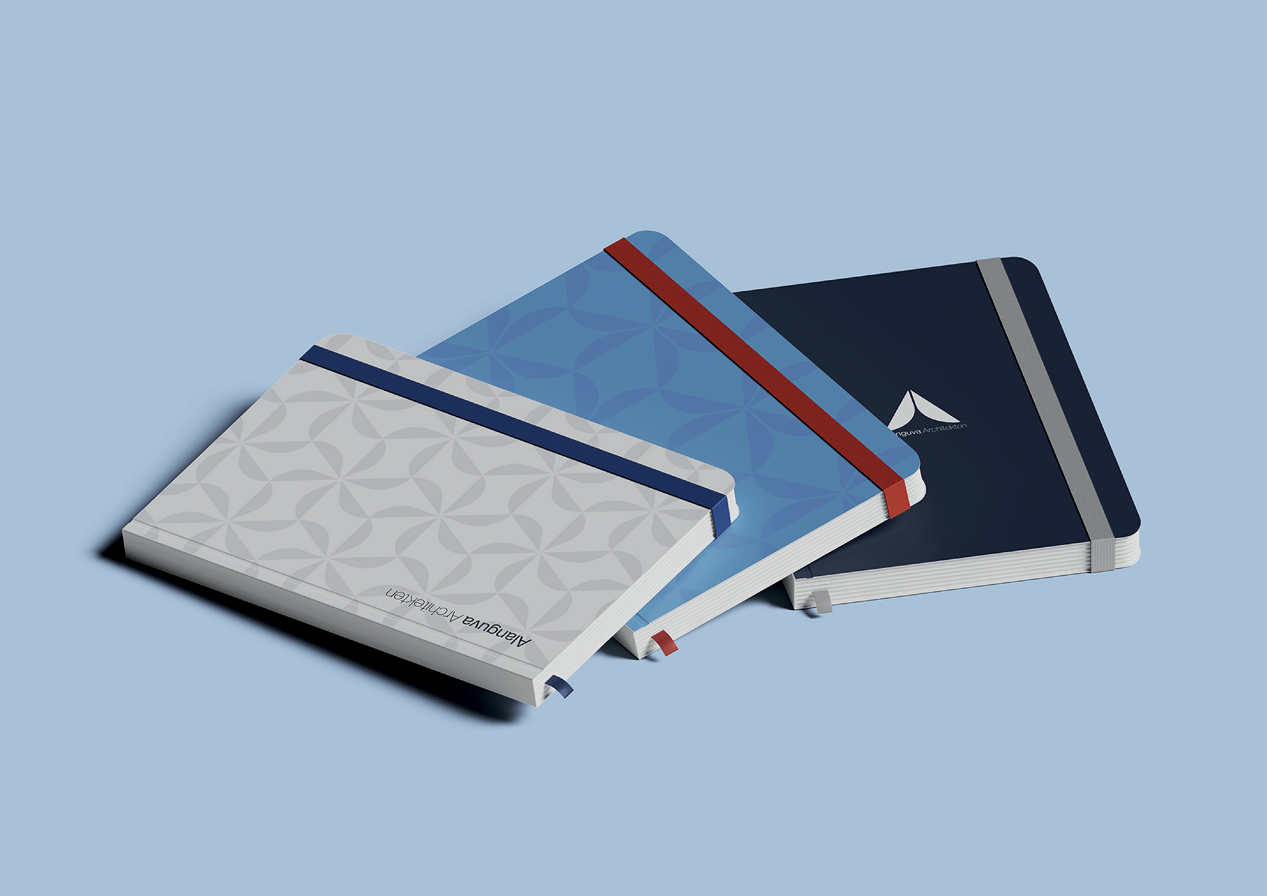
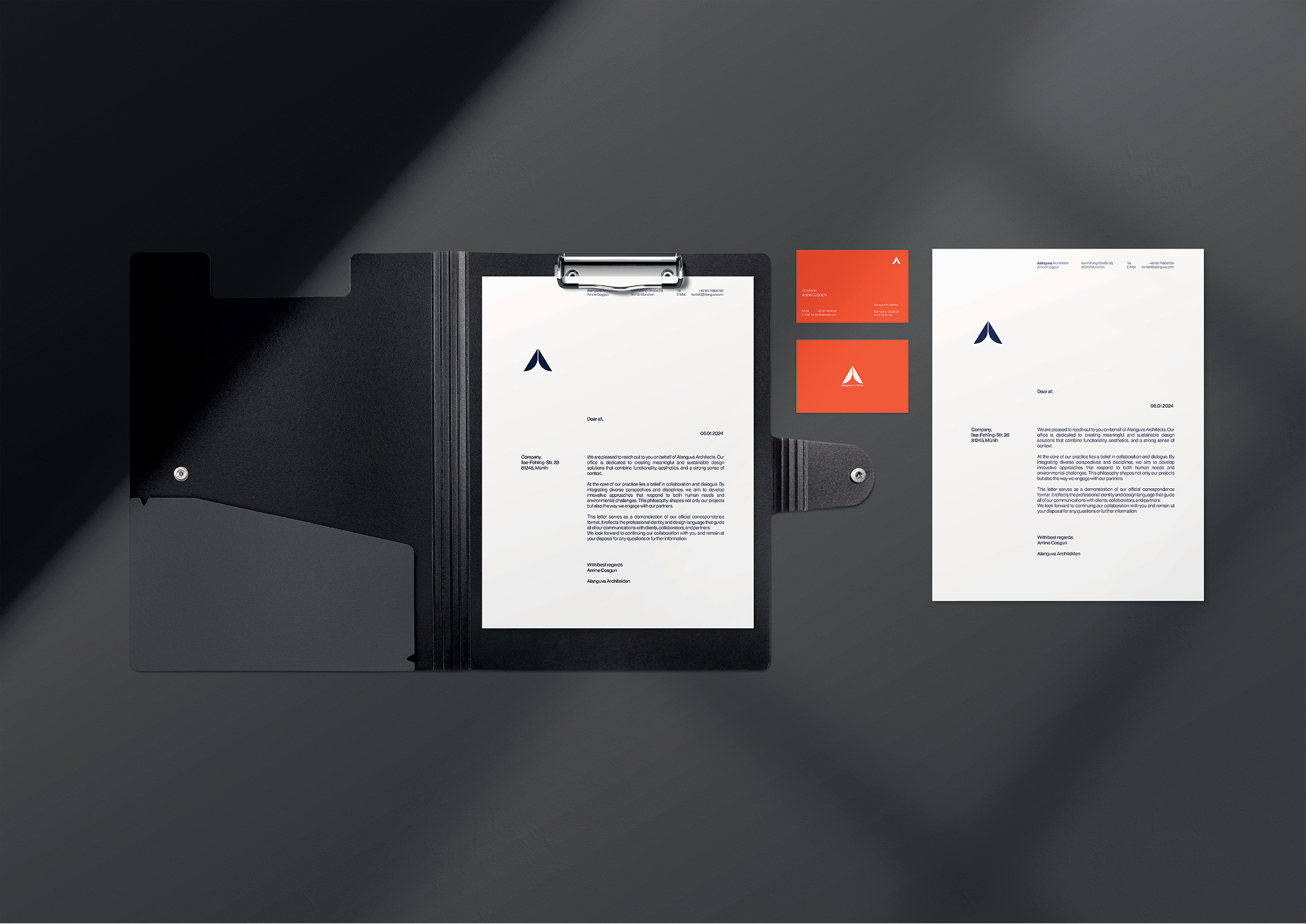
Alanguva Brand Identity

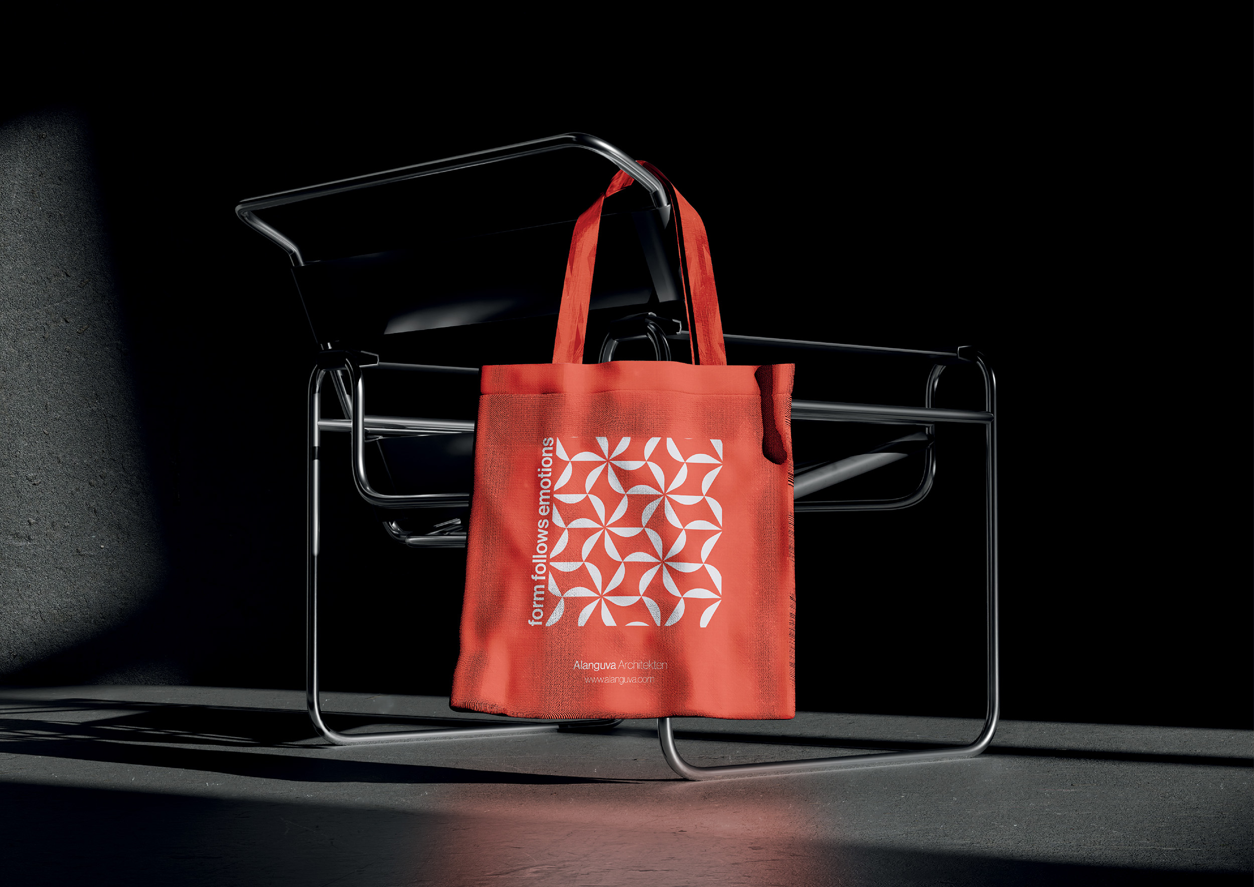
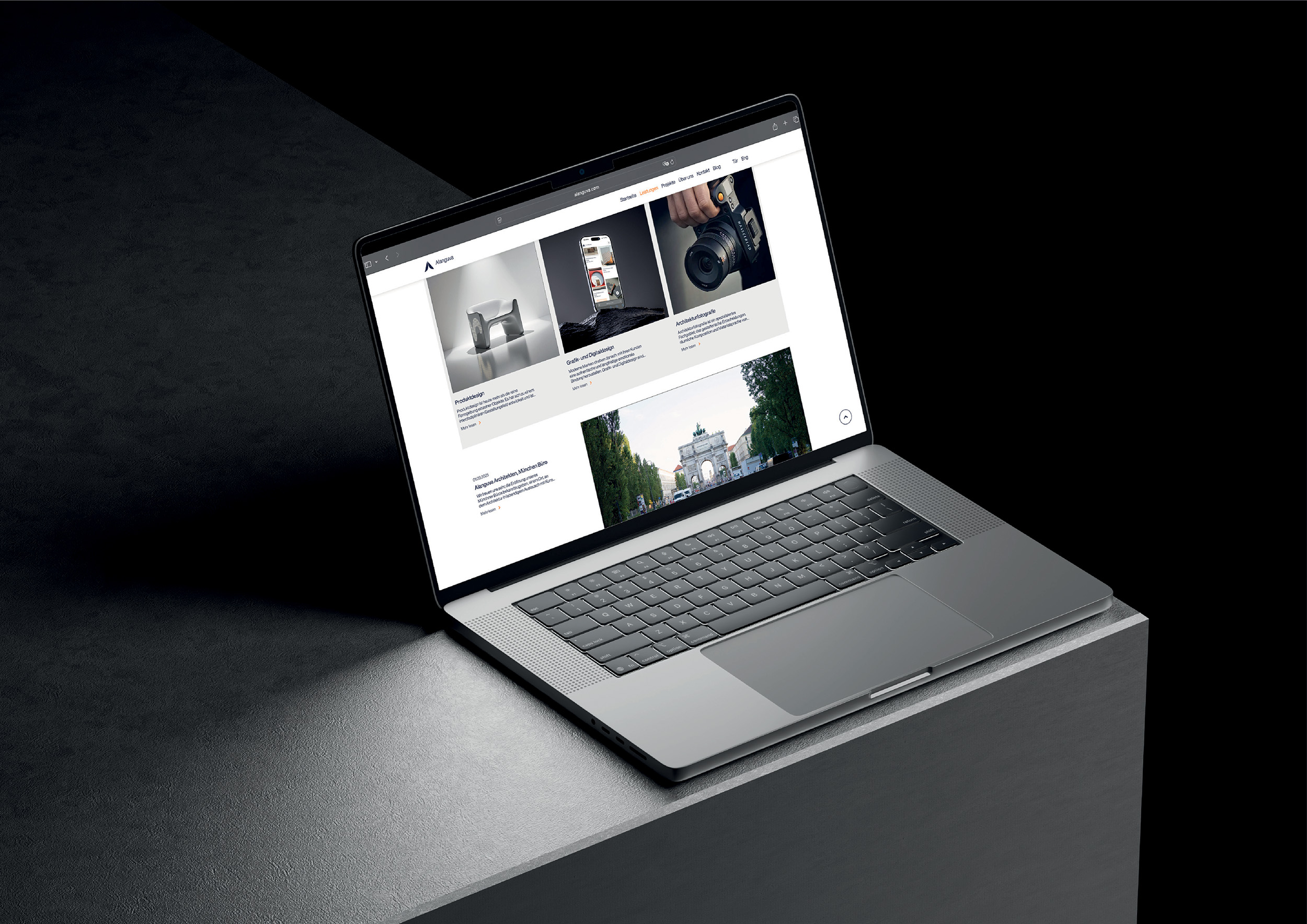
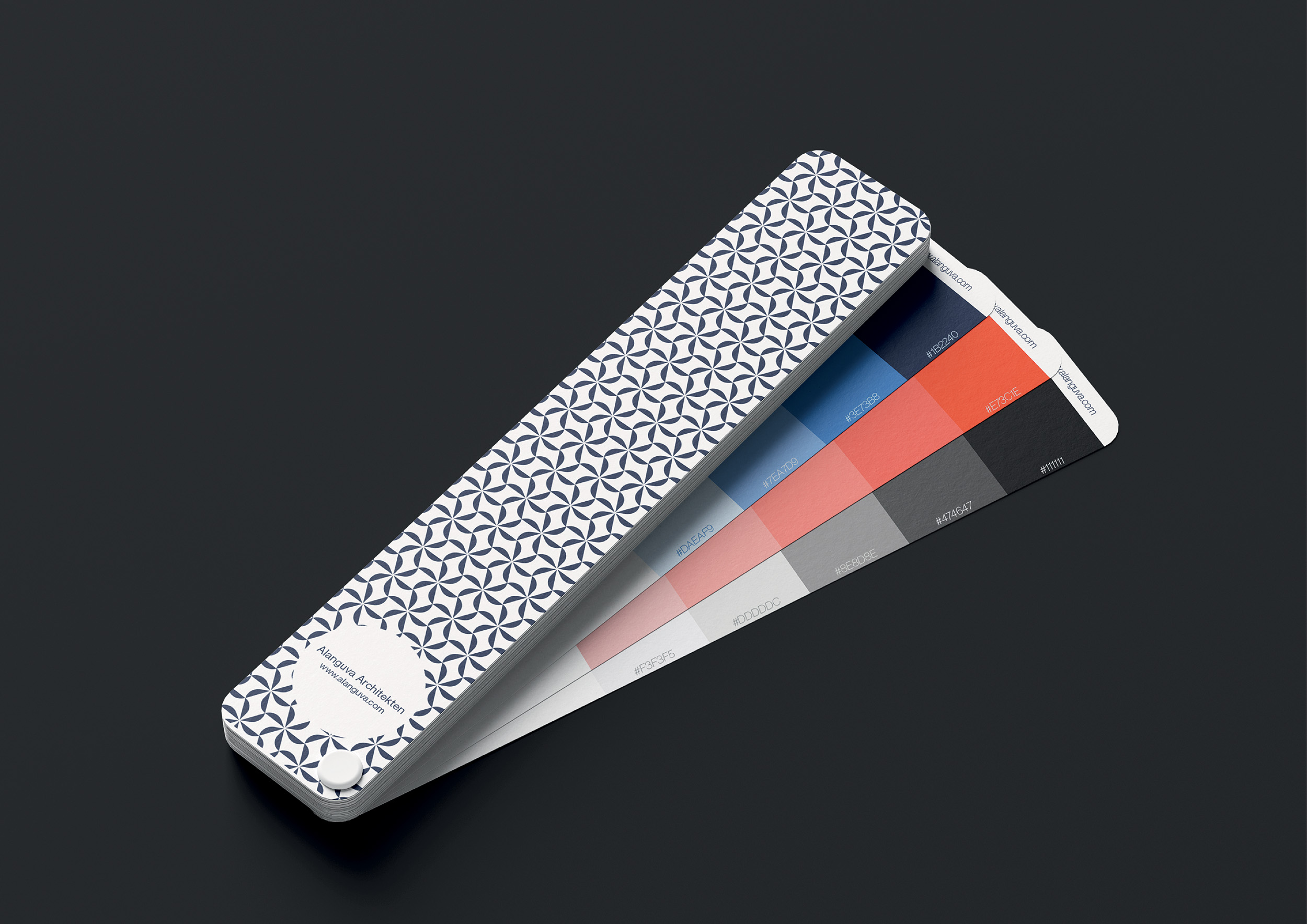
Developing our own brand identity was a special undertaking, guided by extensive work and careful consideration. Our goal was to make a clear stance visible, with simple lines, a reduced expression, yet a striking and memorable impact. This process resulted in an identity that reflects our values and makes us unmistakably recognizable to the outside world. Our brand carries a long, carefully considered history, and it has found its place with the opening of our new office. We celebrate this moment with great joy and pride.
Project Details
Design Team: A. COŞGUN, B. EĞLEN
Disciplines: Graphic and Digital Design
Status: Completed
Alanguva – Purity and Transformation
Alanguva is a mythical figure from the Turkish-Mongolian tradition, regarded as a sacred matriarch and a symbol of origin, purity, and transformation. According to legend, she was touched by divine light and gave birth to children who are revered as the ancestors of great dynasties.

In many accounts, she appears in the form of a white female deer, a being that embodies guidance, beauty, and the connection between heaven and earth. This “Deer of Light” represents clarity, renewal, and the power to illuminate paths.

Today, we understand Alanguva as a symbol that unites history, myth, and timeless values. She carries the memory of origin and transformation and serves as a source of inspiration that excites and shapes us. She reminds us of the pursuit of beauty, the balance between light and darkness, and the responsibility to create with clarity, sensitivity, and consistency.


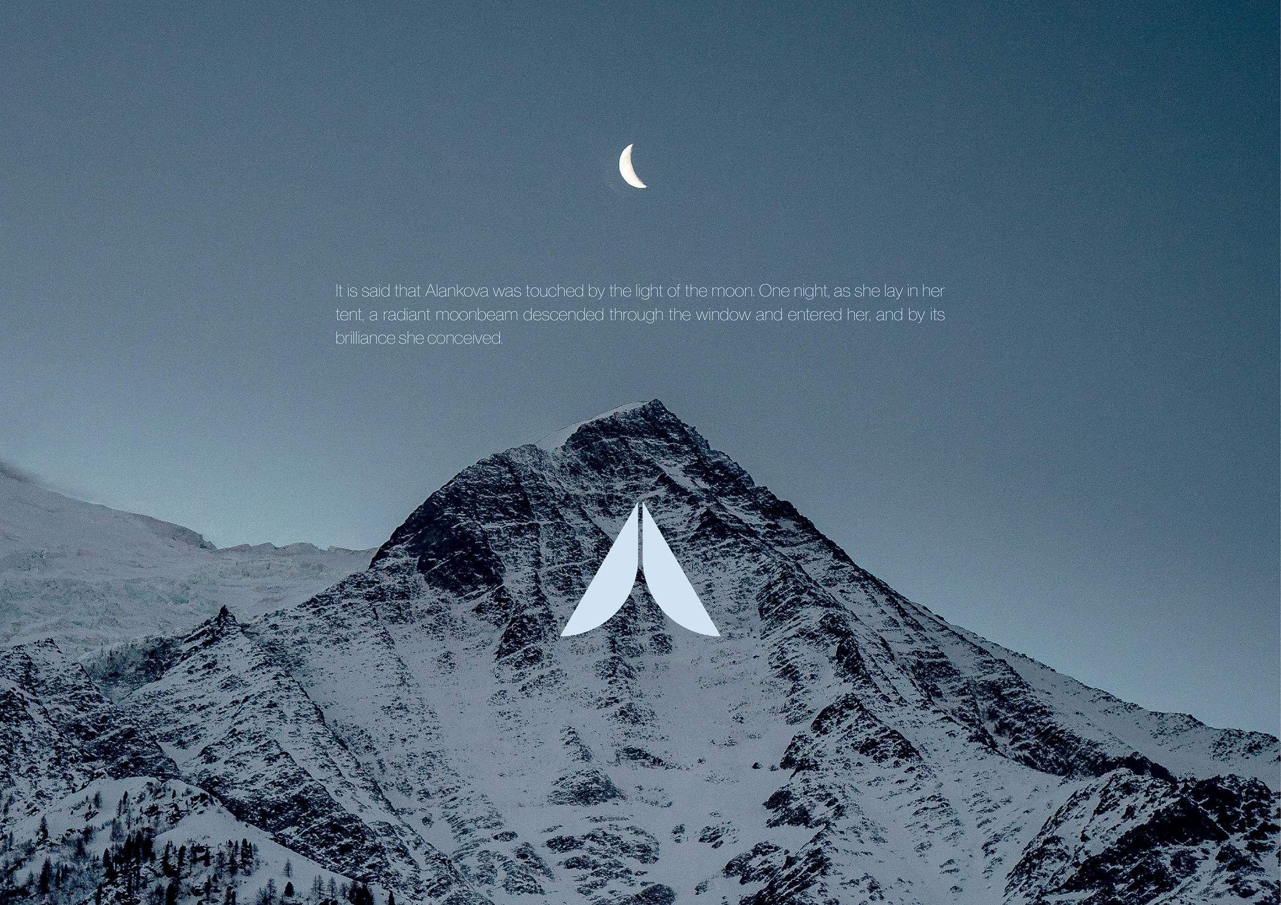
It is said that Alankova was touched by the light of the moon. One night, as she rested in her tent, a radiant beam of moonlight descended through the opening, gently enveloped her, and granted her new life.

In Turkish culture, the Otağ is far more than just a shelter, it is a symbol of centrality, authority, and the sacred. At its center burns the Ocak, the fire, a sign of life and heritage. Above it is the Tündük, a circular opening through which not only smoke escapes, but which is also understood as a connection between heaven and earth, a window to God and the universe. In the Alanguva legend, it is precisely through this sacred opening that the moonlight flows into the Otağ, heralding a new beginning, birth, and transformation.

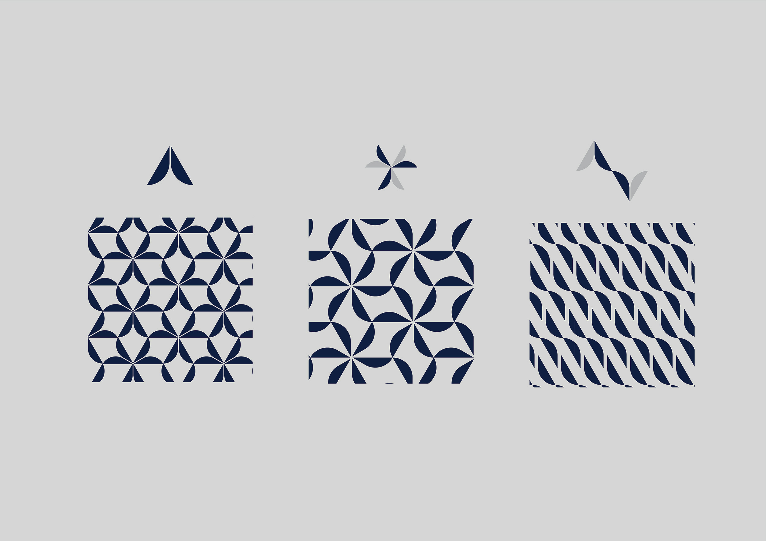
Drawing inspiration from this image, we designed our logo. We stylized the tent, divided the path of the light beam, and thus made the entry of the moon visible. The form became a symbol of transition, illuminated by the moonlight, bringing also our story to the fore.

At the same time, it offers the possibility of creating diverse patterns and styles from a single motif. In this adaptability, it reflects architecture itself, layered, multidimensional, and constantly in the process of renewal.

Thus, our logo became more than a symbol: it transformed into a living narrative, one that can be read anew each time, revealing new meanings and unveiling another layer with every glance.